l
As a semester-long project, students were given a packet of various industries and companies in which to design a logo and identity system. The first phase of this project was to concept and sketch potential logos for at least 5 companies in different industries. From these designs, one mark would be selected one to build out into a complete brand system.


l
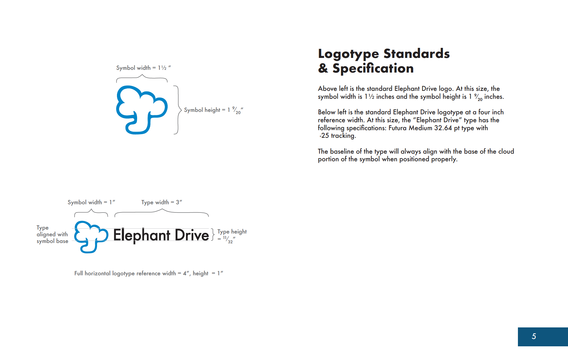
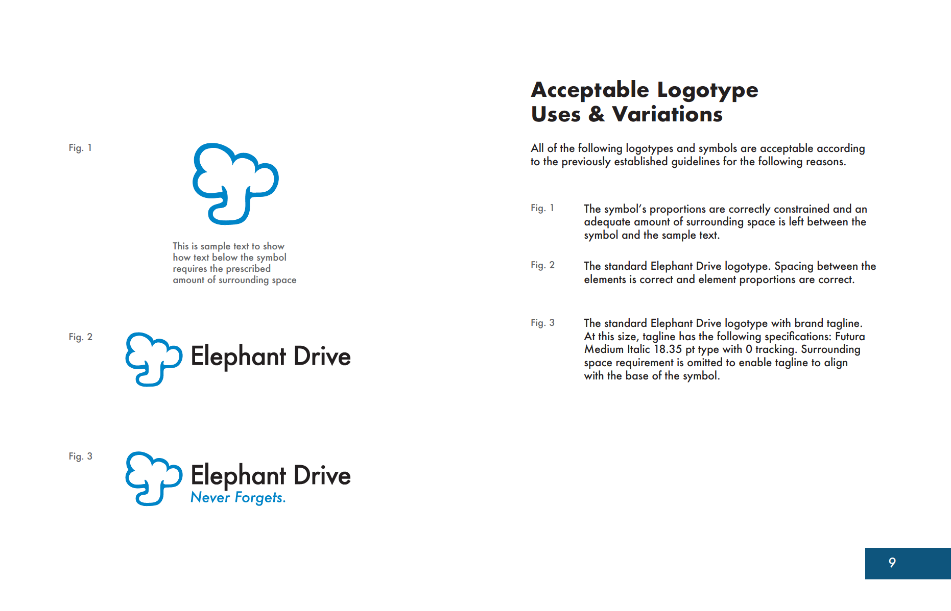
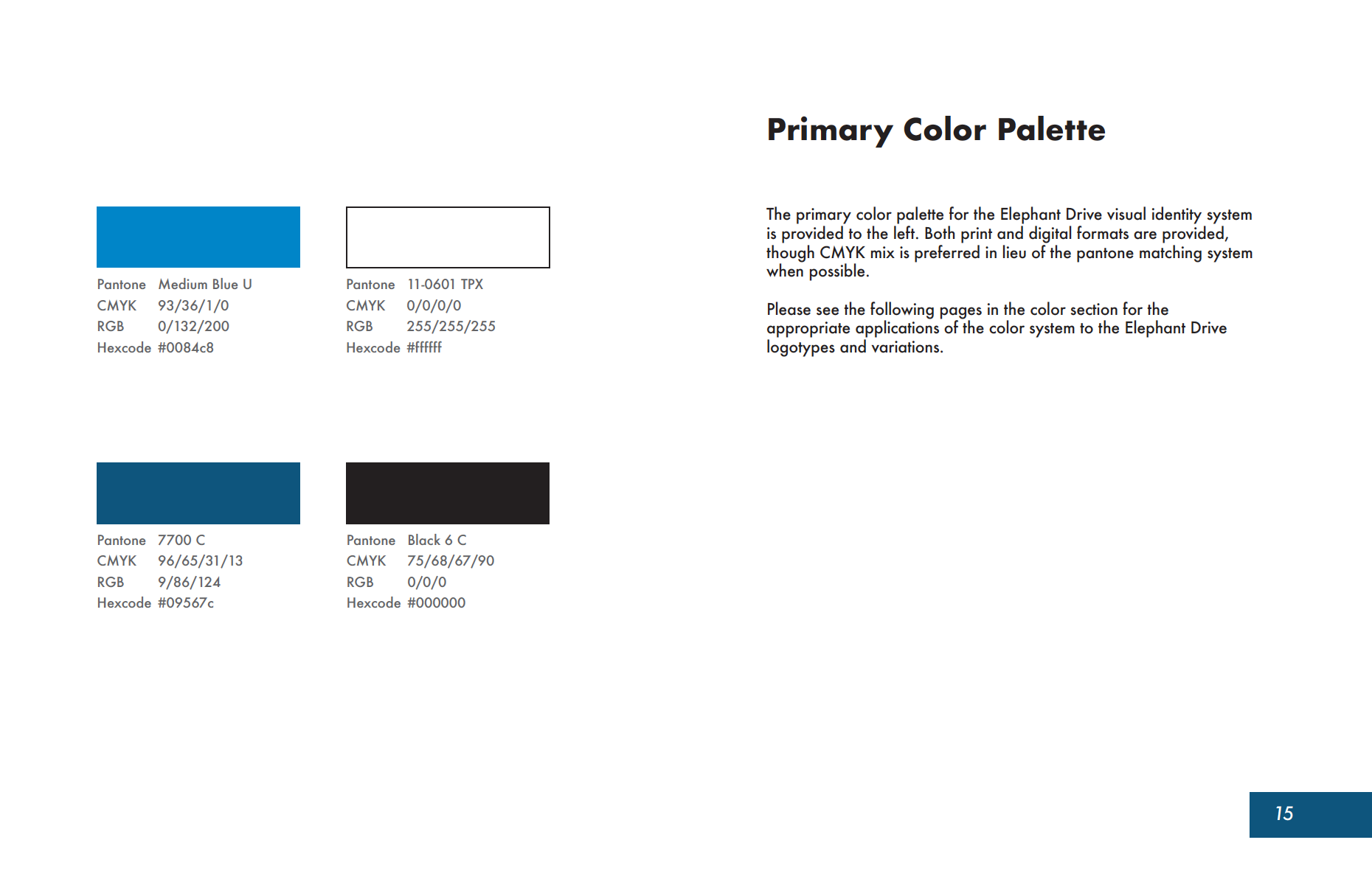
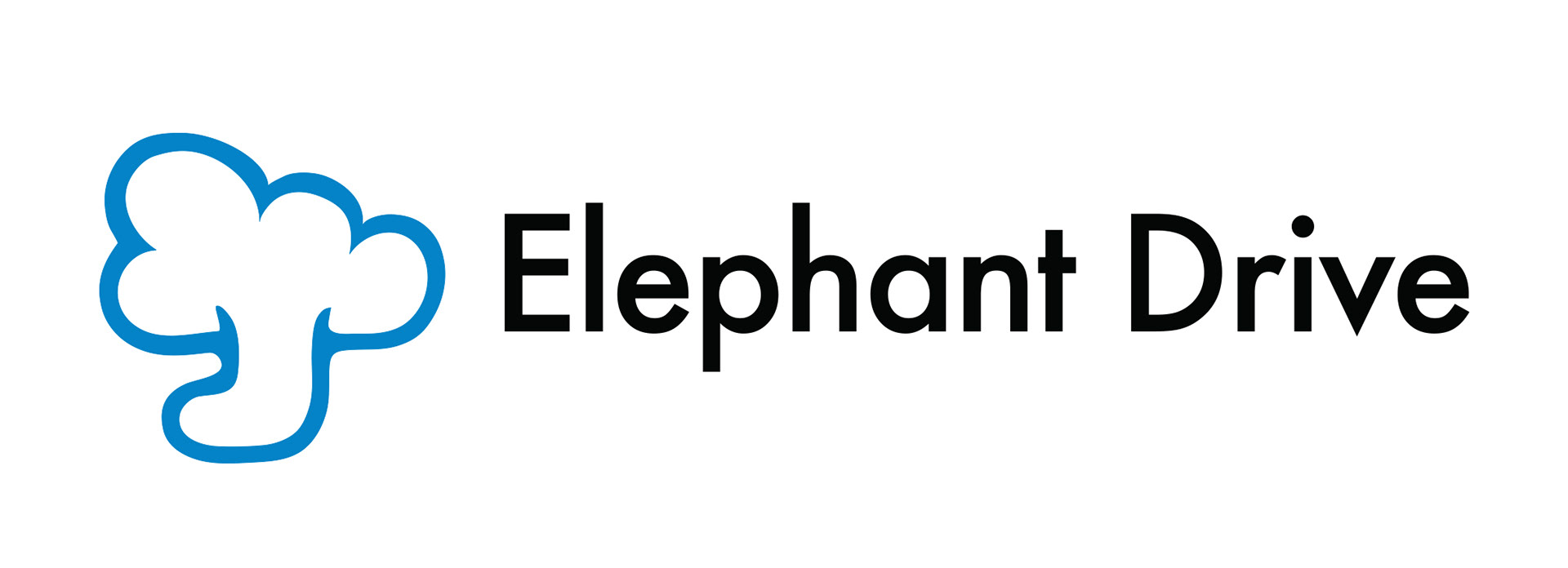
After carefully reviewing each logo, the mark for cloud computing company, Elephant Drive, was selected as the one in which to create the brand identity around. My goal was to create a brand that felt clean, modern, and to break the stereotype of cloud computing being something boring and uninteresting. The symbol itself is a combination of two images: a cloud and an elephant as a play on the classic use of an arrow and a cloud to convey cloud computing technology. The typeface Futura was selected for the logomark to maintain the modern, professional look and feel while also establishing longevity for the identity.
l
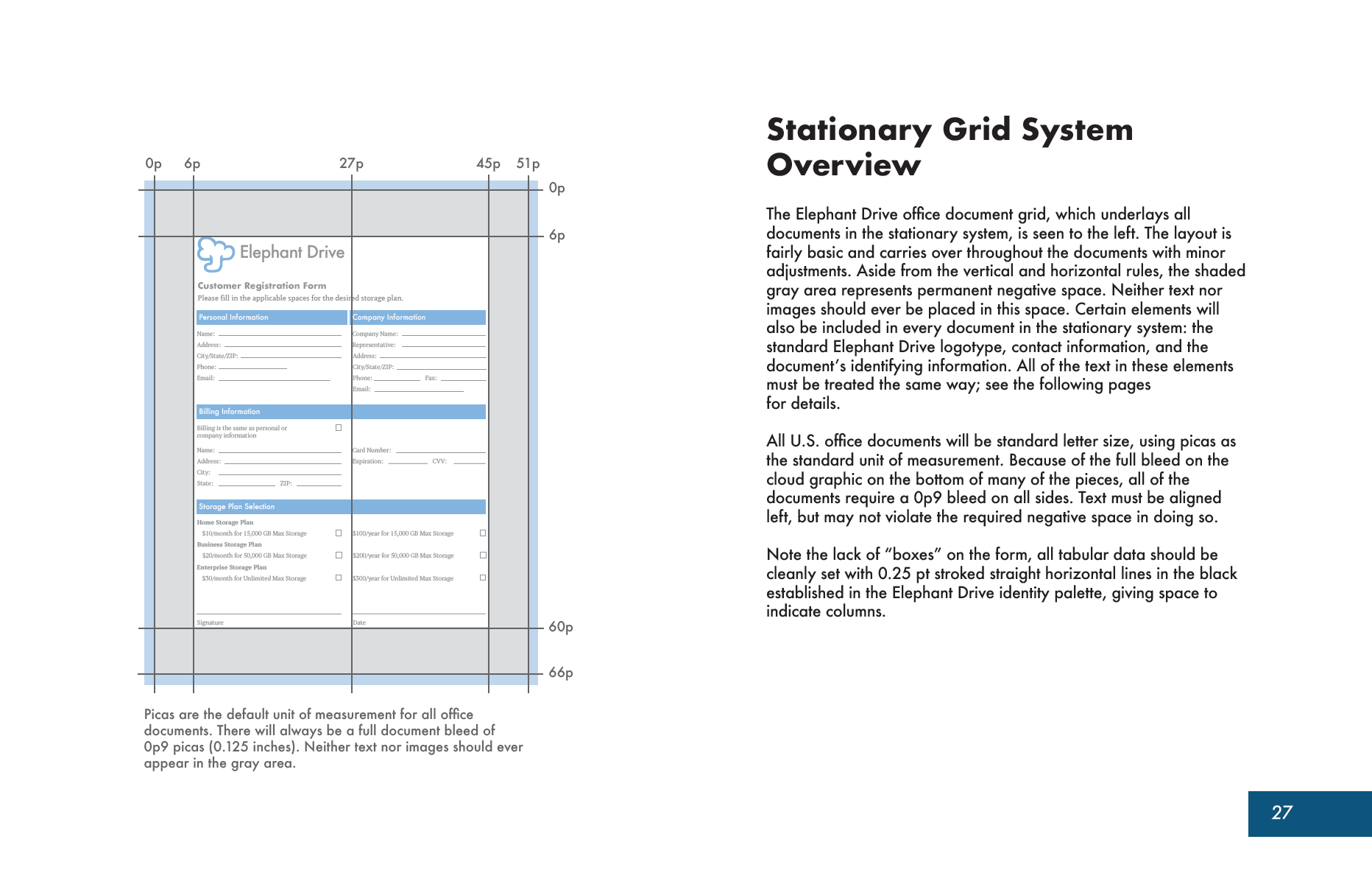
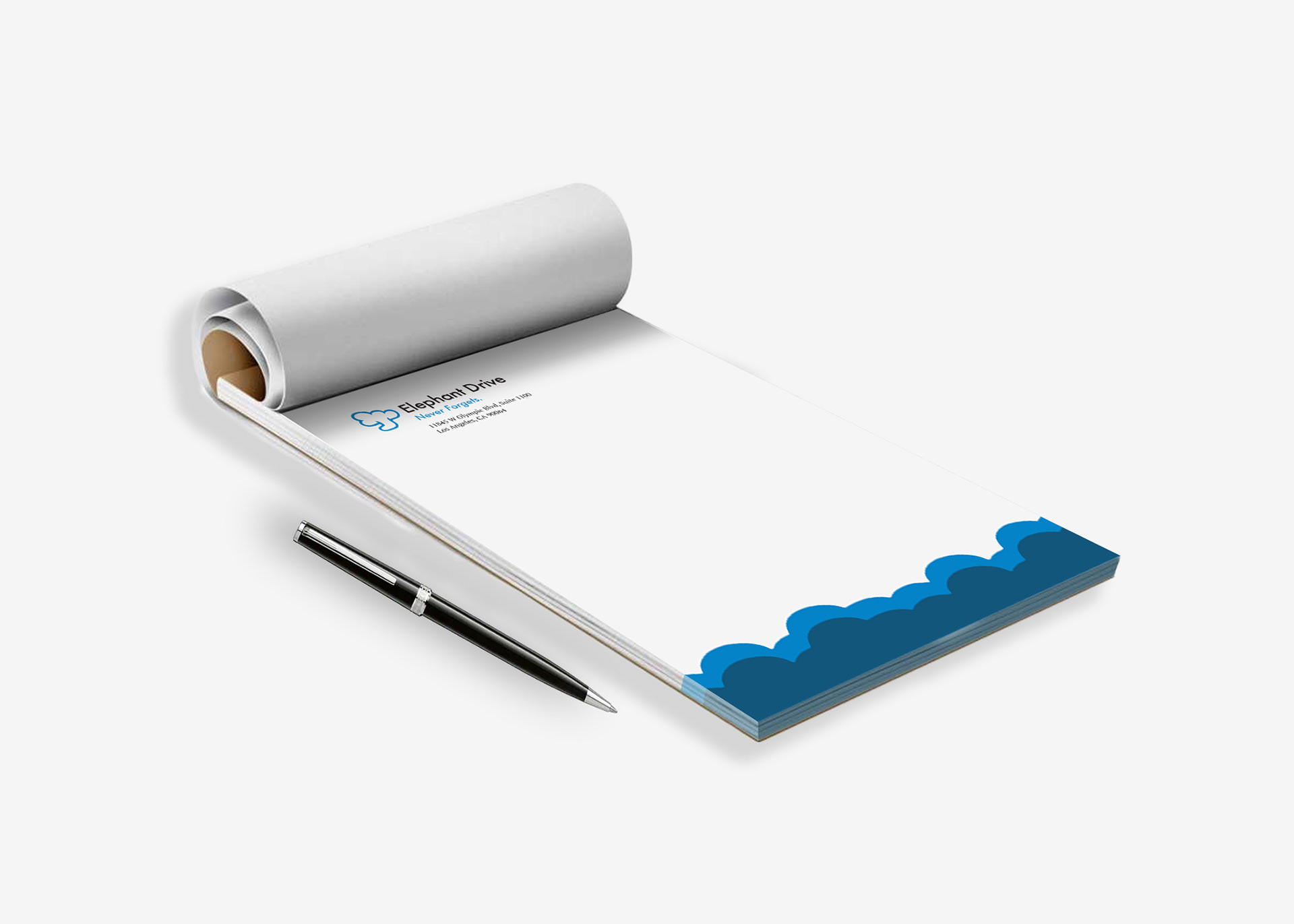
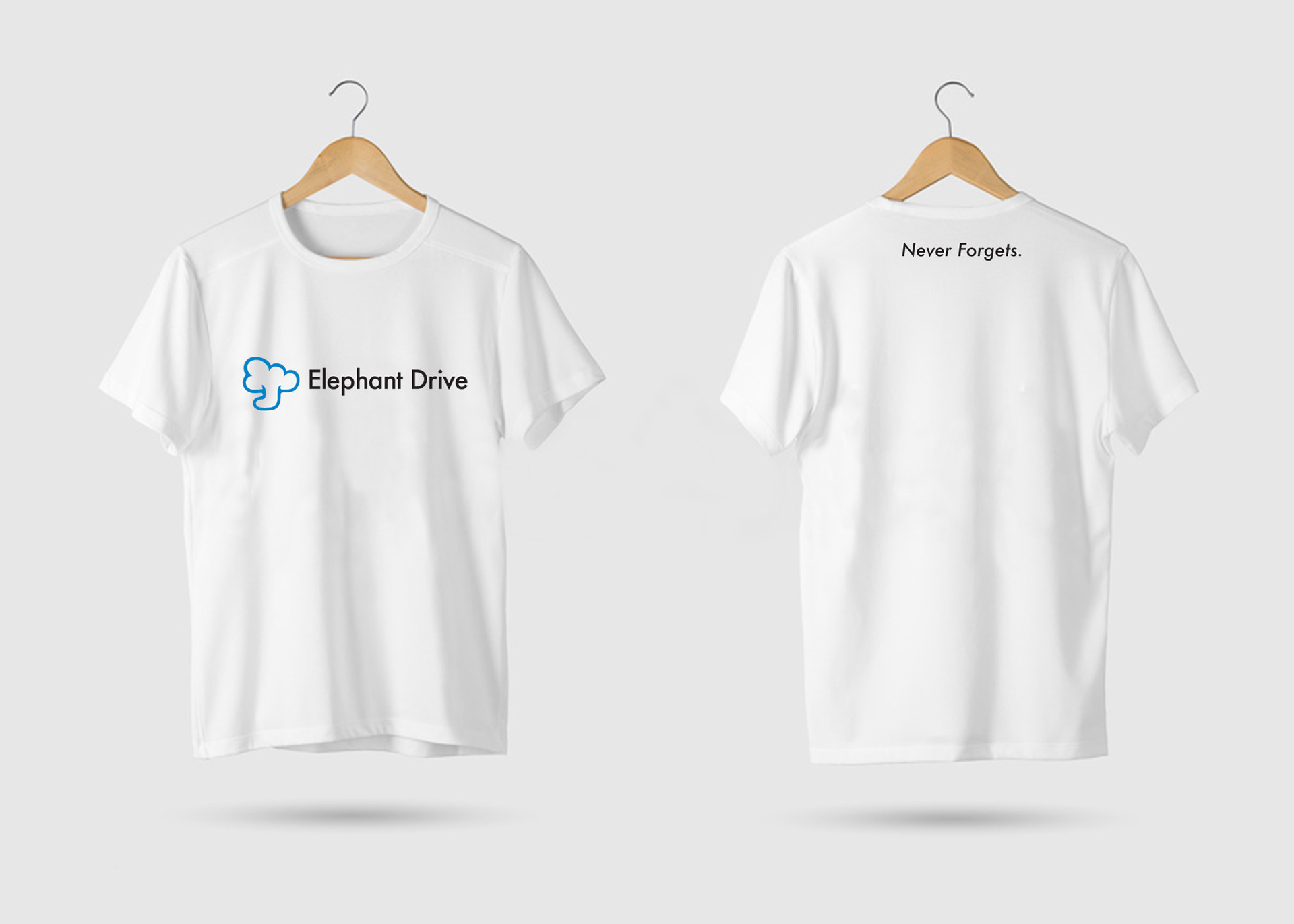
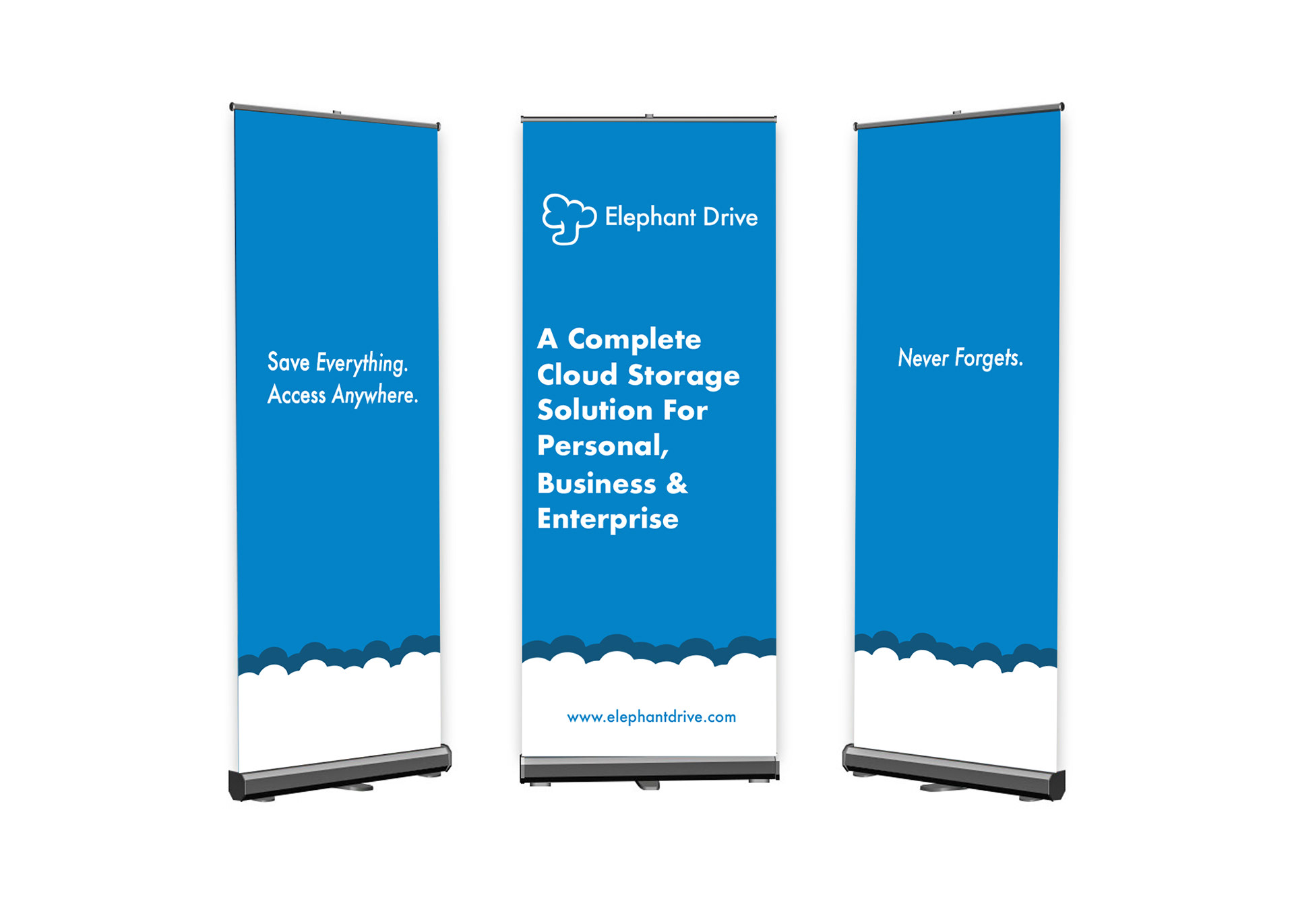
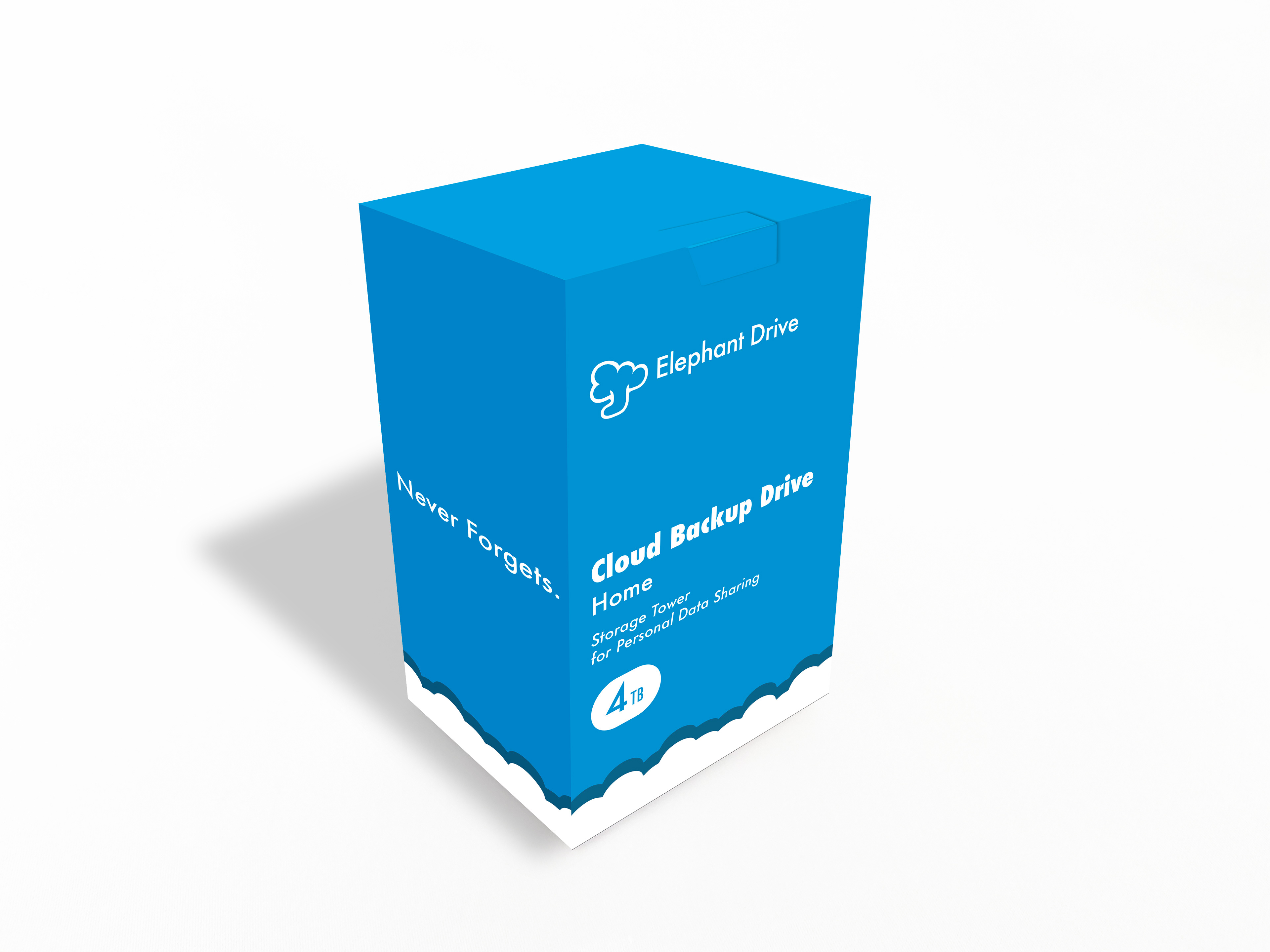
Below is a selection of brand collateral which includes stationary, packaging, and various promotional items. The supporting cloud graphic was developed as a way to drive home that Elephant Drive is a cloud computing company, while also adding a more welcoming aesthetic to the brand.
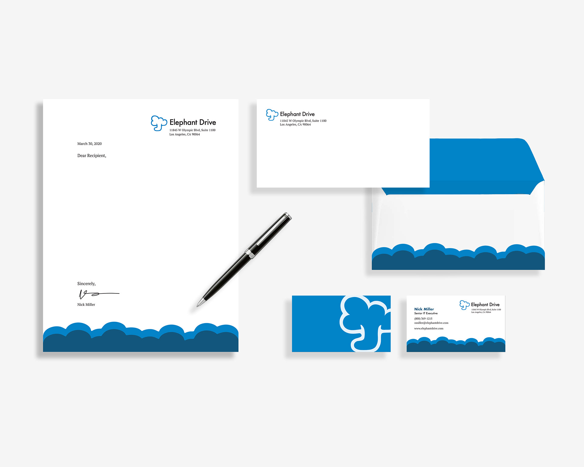
Brand Stationary Set
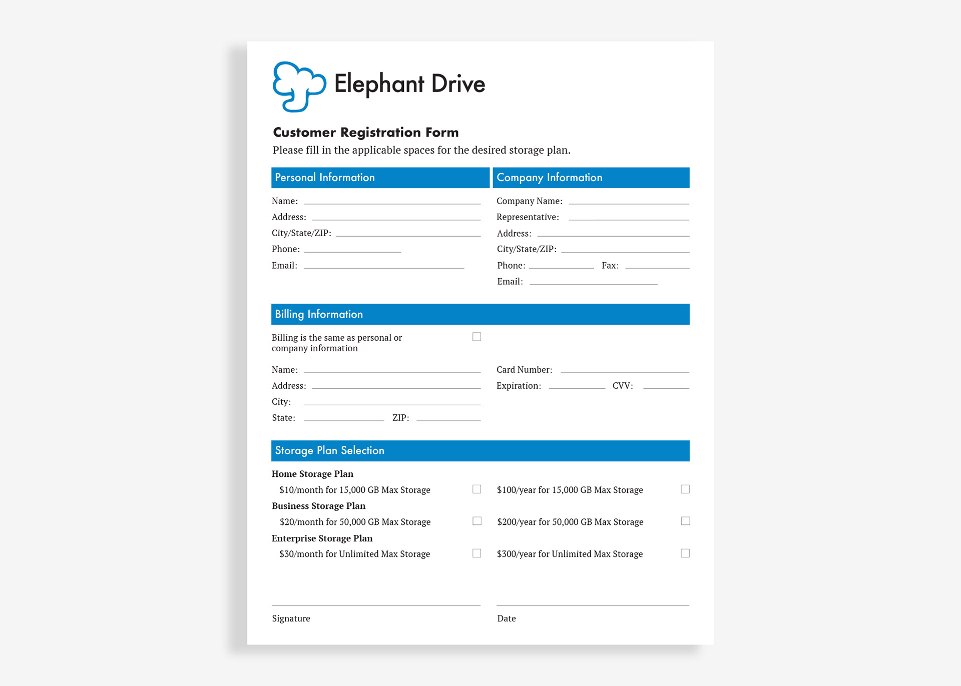
Applications


l
Finally, the last phase of this project was to create a usage manual for the brand to further explain proper uses of the logo, logotype, fonts, grid system, and applications. Below are samples of a few of the pages from the usage manual.